The Power of Color: Choosing the Perfect Palette for Your Space
Color can completely change the vibe of a space. It sets the mood, creates flow, and can even affect how you feel day to day. I’ve worked with clients who thought they wanted all-white everything—until we brought in the right shade of green or a warm terracotta and suddenly the space felt alive.
So how do you pick the right colors for your home or business? Let’s talk about it.
Color = Energy
Before you dive into paint samples, ask yourself: How do I want this space to feel?
Color impacts mood more than people realize. Here's a quick breakdown of what certain hues say in a room:
Blues – calming, clean, great for bedrooms and bathrooms
Greens – grounding, fresh, ideal for living rooms or entryways
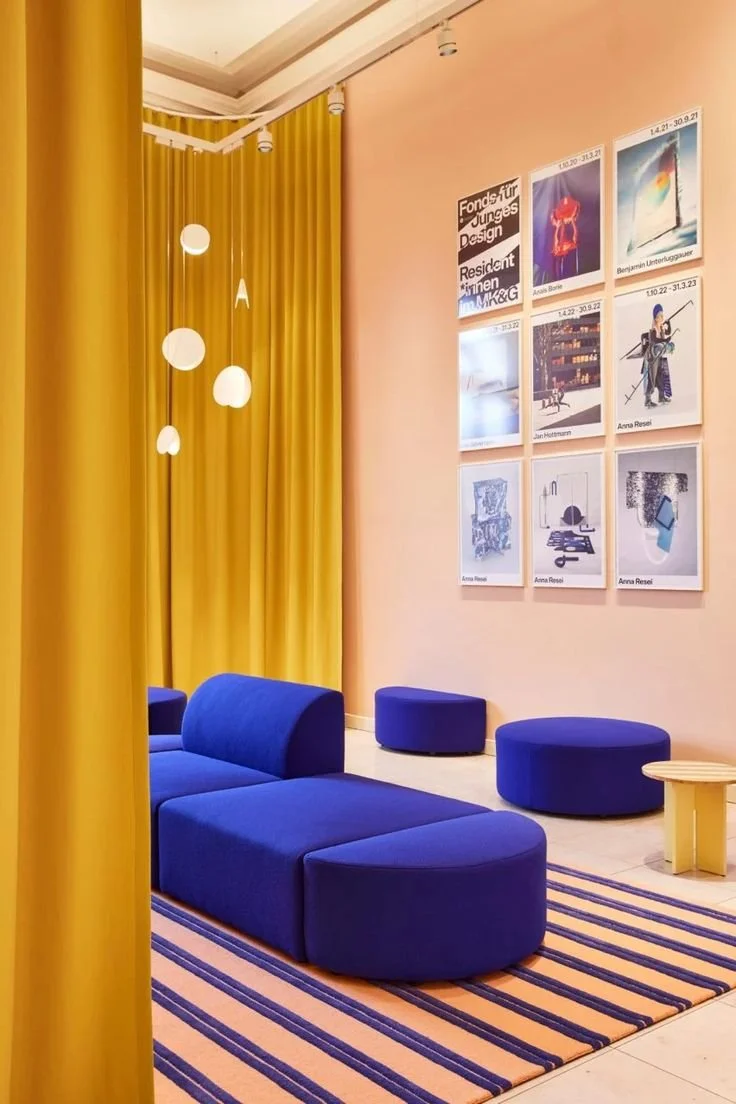
Yellows – energetic, joyful, perfect for kitchens or creative spaces
Neutrals – versatile, calming, great for open concepts or layered looks
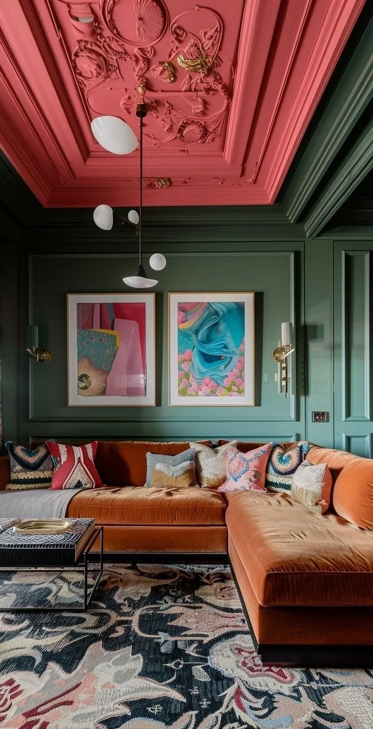
Darks (navy, charcoal, black) – moody, bold, best for drama in dining rooms or offices
Warm tones (rust, terracotta, blush) – cozy, earthy, great for adding comfort without going beige

Match the Mood to the Room
Every space has a different purpose—and the color should support that. Here’s how I typically approach it:
Bedrooms:
Think calm and restful. I love muted tones, soft pastels, and even deeper shades like olive or mauve to create a cozy retreat.
Living Rooms:
This is where you want warmth and personality. Neutral bases with pops of color through pillows, rugs, or art work beautifully. If the light is good, don't be afraid to go bold on one wall or the ceiling!
Kitchens:
Kitchens are high-energy zones. Crisp whites with warm wood tones or a soft green backsplash can make a space feel both clean and welcoming.
Bathrooms:
Spa vibes? Go for cool tones like pale blue or sage. Want to go glam? Try deep navy or even a high-gloss black with brass fixtures—trust me.
Offices:
You want to feel inspired and focused. Soft greens or warm neutrals help you stay grounded, while touches of blue promote productivity.
Tips for Building a Cohesive Palette
Start with one anchor color – This could be a wall color, sofa, or rug. Build your palette from there.
Use contrast wisely – Don’t be afraid to mix light and dark. A beige room with black accents? Always a win.
Test in natural light – Paint colors look very different in morning vs. afternoon light. Always test samples first.
Bring in texture – Even if you love neutrals, layering textures like linen, wood, leather, and stone adds depth and warmth.